 My Bauhaus is better than yours.
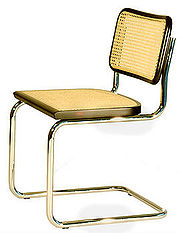
We decided to spend our time at Wok Store (Via Col di Lana 5A) with the guys coming from Weimar School (Germany) last night. The Aperitivo was in program yesterday and we liked it a lot !! You could visit the exhibition until 24 th of April. We would remind you something about this important school, famous for the Bauhaus movement. Weimar School has been one of the most important school of arts, design, architecture and applied arts in Germany from 1919 to 1933, and it has been the base of the Bauhaus movement founded by the architect Walter Gropius. The Bauhaus style had a profound influence on modernist architecture and design. The radically simplified forms, the rationality and functionality, and the idea that mass-production was reconcilable with the individual artistic spirit – were the concepts of Bauhaus thinkers. The movement was focused on architecture and furniture. A famous symbol is the Cantilever Chair designed by Mart Stam.
Today the Bauhaus University continues his activities with the same creative attitude, thanks to the past, but following contemporary ideas and trends. As the 90th jubilee of the founding of the Bauhaus is being celebrate in Weimar, the students and graduates of this University have come to Milan. Polkadot thinks that one of the best ideas of the students is an environmental approach, really close to the Bauhaus philosophy. This is what we have seen inside the exhibition.
Narrative Augmented Reality Chandelier by Julius Kranefuss.
It’s a chandelier made from recycled Pet bottles embedded with leds. Thanks to motion detection, the chandelier reacts to its environment creating light impulses. It is like a digital display and we think it has got a technological style but it is made starting from recycled materials. A good idea in order to mixing design and ecological skills.
[nggallery id=7]
14% by Laura Stra?er
A complicated experiment focused on material: porcelain. In the firing porcelain shrinks by 14%. This is a problem for the porcelain industry. Regarding the ceiling light, the porcelain screen was casted five times in a row. But this disliked attribute of the porcelain was challenged by 14% cover light. It generates an almost organically looking alteration in the porcelain screens of the light.
Ohrensessel by Hannes Grebin.
A bourgeois piece of furniture. Looking this armchair the first impression is not the comfort. Several and geometrical rough edges are irritant and the mix with tapestry is crashing. Not chic, not comfortable, not pleasant on the aesthetic side. It’s kitch? Tapestry kills the Bauhaus rationalism. An ironic provocation in Polkadot’s opinion.
Sigma by Stephan Bohn.
Just essentiality. Plywood is the only one material used by the designer, no screws and no glue! All the parts are assembled thanks to a milling machine. Tables, chairs and stools have been made by this process. It is good idea to reduce costs and materials and pieces are thin and can be simply trasported and installed. Functionality, rationality and simplified forms, that’s really Bauhaus attitude!
Rocky by Georg Panther.
Do you remember Rocky? He used a normal black boxe sack. Do you think a killed animal could be helpful for a boxe training?


