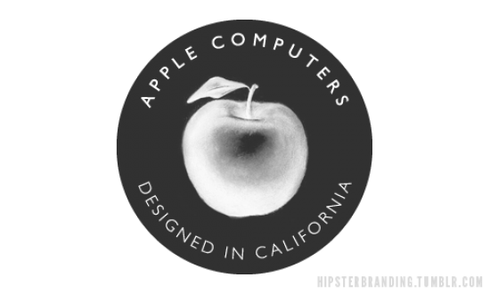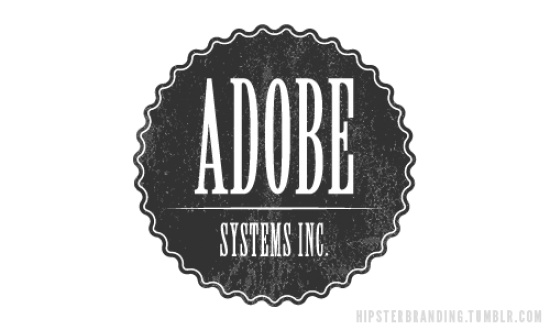
Think about hipster graphic identity – mags, album covers, patterns or icons on clothes, etc. Of course a common aesthetics emerges, like the massive use of slightly vintage and minimal fonts, together with an aloof strike-a-pose style made of lomo overexposed images or pixelated elements. But have you ever noticed the abuse of anchors, mustaches, Helvetica, glasses, and the big crossed lined X’s? 22-year-old Dave Spengeler, a self-defined “mediadesigner and soon-to-be typographic designer from Switzerland”, actually does: he decided to denounce this trend by creating a witty tumblr where a lot of world famous logos are translated into hipster graphic language. In an interview for Co.Design, he admits: “I’m fed up with the latest design trend. Everything has to be ‘vintage’ style, type has to be centered, all-caps, or written calligraphically. There are lobsters, birds, ribbons, anchors, crowns, arrows, crests, and the famous X everywhere. Personally I like this kind of style. But slowly but surely these cliches are getting overused.”
A part from the parody of “put a bird on it” aesthetics, Spengeler’s work makes us reflect about the relationship between a logo and the dominant taste of the times: “A logo, a symbol that should represent and stand for something, for a long time, shouldn’t follow any trends. It should be unique, timeless and a contrast to your competitive businesses,” he writes. Actually, once for a while, we’d like to imagine Goldman Sachs as a competitor of American Apparel, Adidas as a sub-brand of Urban Outfitters, Apple as a chain of vegan mini markets or Red Bull as an indie fest during the same weekend of Coachella.


