Think about hipster graphic identity – mags, album covers, patterns or icons on clothes, etc. Of course a common aesthetics emerges, like the massive use of slightly vintage and minimal fonts, together with an aloof strike-a-pose style made of lomo overexposed images or pixelated elements. But have you ever noticed the abuse of anchors, mustaches, …
Laura Lampugnani
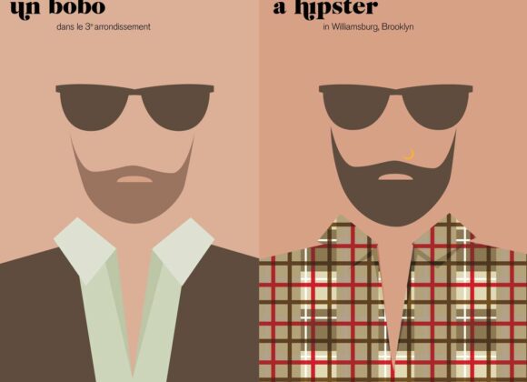
Dreaming of a pied-à-terre in Montmartre or of a loft in Upper East Side? Having a baguette for dejeuner or a bagel for brunch? Fan of Stars and Stripes or of blue-striped tees by Jean Paul Gaultier? All these contrasts and dichotomies between two cities, two visions and two ways of life are brilliantly described …
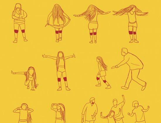
Wanna play DanceStar Party in the shoes of Mia Wallace? Wanna impress Doctor Frank-N-Furter dancing a perfect Time Warp? Now, thanks to unconventional artist Niege Borges (Brasilian designer and illustrator) you can perfectly keep in step. Enjoy this eye-candy gallery of famous choreographies from movies and TV series. And don’t miss to read the explanation …
Clearly inspired by the amazing project The Flow Market, half eco – half design, (Denmark 2004), Danish visionnaires are coming back with another mind-opening hybrid between poetry and art. Written and produced by Morten Søndergaard and designed by Christian Ramsø, Wordpharmacy project is described as “a concrete poetical work, which playfully equates the structure of …
Tired of just observing fashion? Bang go static magazines and flat websites!
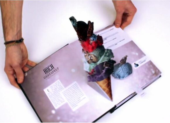
In order to get fashion a shake, eclectic German designer Ruben Scupin brings the experience of vogue like never before. His Bahelor’s project, entitled HARD, is a Bookazine (of course, half a book, half a magazine) wich features all the elemets of paper crafting to make you go ‘wow’. Great graphic ideas, a little bit of popupping, lenticular images, stitching and much more. Is Conde Nast hiring, at the moment?
Street art is evolving as fast as urban cultures. After the never ending fight between graffiti art (RobboWar) and new forms of street expressions, like stenciling (Bansky), now it’s time to experience different styles and materials.
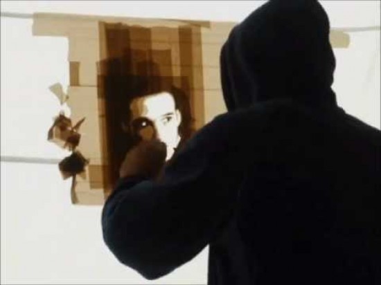
Amsterdam based artist Max Zorn is able to create stunning works, using packing tape and a scalpel as his only tools. He actually uses only a single tape on a transparent surface (plexiglas), creating several layers – and so light effects – as he goes along.
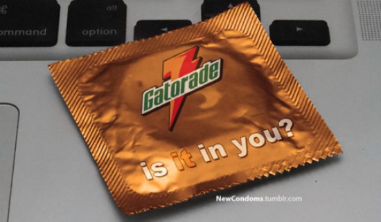
Have you ever noticed how many world renowned brand payoffs are actually letting slip a double entendre? Apply them on a product like condoms and then you’ll get it. It’s spoof time! Young creative Max Wright (who describes himself as “Max Wright.19.Straight.Los Angeles.”) takes slogans of famous brands and then applies them on condom packages. …
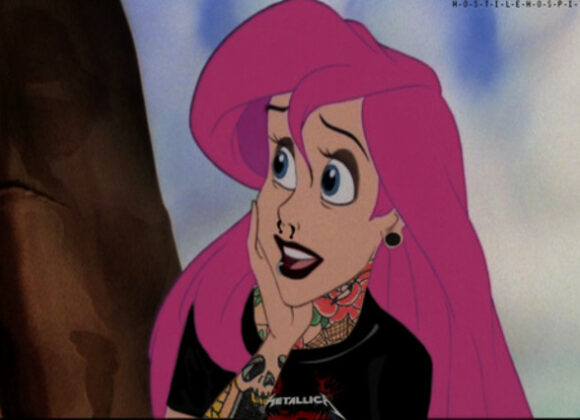
It’s no time for static fairy princesses to shine any more. Modern goth lolitas are now bursting onto the scene. If Lisbeth Salander is the new contemporary female icon, Disney flippant princesses need to freshen up: tatoos, piercings, punk hair and metal tees. When the Blue fairy is Vivienne Westwood. Unfortunately anonim author, but check …
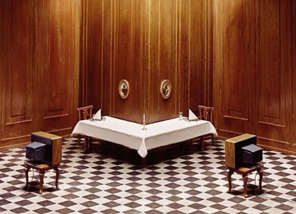
Dystopian universes, middle-class nightmares and surreal architecture: German photographer Frank Kunert portrays a satire of contemporary society through his intricate, flawlessly detailed miniature models. He actually creates 3D model subjects out of deco boards, plasticine and paint and then he photographs them, with his impeccable attention to detail. Frank Kunert’s photographs were part of NYC …
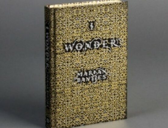
“’I Wonder’ is not only a source of inspiration, but also a beautiful work of art.” —HOW Magazine A joyful and enigmatic Pandora’s vase full of baroque patterns, laces and arabesques you can pick from your bookcase whenever you feel blue. Funny and astute, poetic and charming, “I Wonder” is the latest book/masterpiece by world-renowned …
Lomo addicted, fierce hipsters, vintage forgers, the time is now.
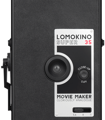
Now your niece’s pram can tumble down the stairs in a very original Odessa style, thanks to Lomokino: Lomography goes video with this 35mm Movie Camera which shoots a movie of 144 frames on any 35mm film. No sound, no special effects, no post production, but an incredibile design object to carry along with you to every indie fest. The LomoKino is also available together with the Lomokinoscope, which allows you to watch your developed LomoKino movies in the most analogue way possible (load your movie rolls into the film containers and watch the movie unfold before your very eyes).
Didn’t think you needed an iPad? Think again! Instructions for a stylish dive into the past? Enter the iCADE iPad Arcade Cabinet! – Gently slide the iPad into the cradle. – The iCADE uses Bluetooth to connect to the iPad. – “Insert coin” and game on! Atari, the first name in classic arcade games, also …
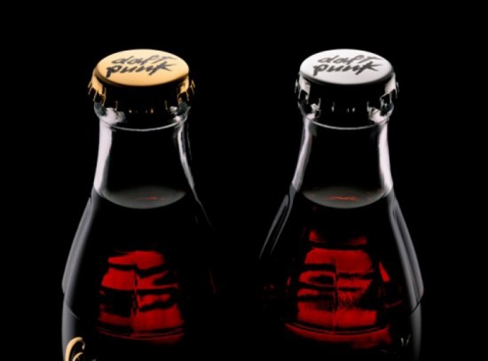
Since Limited Edition is the sexy word of nowadays marketing, a SupaLimited Edition is the only way to stand out. After the Daft Punk inspired Club Coke 2011 bottles of the first part of the year, new official Daft Punk + Coke collection is now available for a small bunch of lucky fans. The classic …


