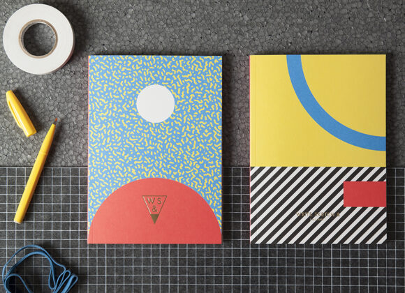
Founded in 2014 by designers Matteo Carrubba and Angela Tomasoni, already creative directors studio Officemilano, Write Sketch & creates high quality stationery products, with a tradition-bound Italian production and an international vision. The first capsule collection of notebooks is the collection Super!, a tribute to Italian Postmodern movement, active in Italy since 1980. All notebooks …
TYPOGRAPHY
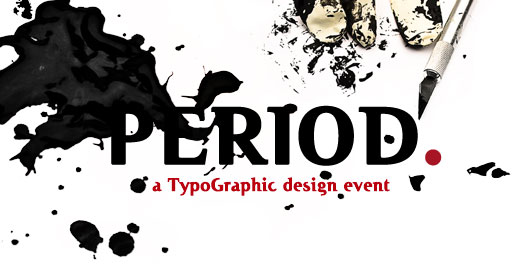
L’Associazione Culturale Thype!, uno dei punti di riferimento per gli appassionati del letterpress in Italia, torna con un nuovo ciclo di eventi dedicati al design, e lo fa alla grande con una quattro giorni torinese che promette fuoco e fiamme. Tre giorni dedicati a workshop con alcune delle più importanti realtà italiane del making e …
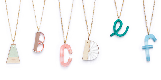
ABC Collection from Amsterdam based jewelry designer Sandra Turina. Firstly she studied letter’s shape with a graphic designer, then she created them with different materials such as wood, glass and plastic. U is my favorite, and is for Ufo. What’s yours?
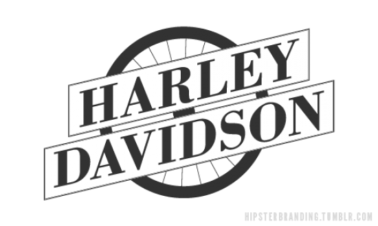
Think about hipster graphic identity – mags, album covers, patterns or icons on clothes, etc. Of course a common aesthetics emerges, like the massive use of slightly vintage and minimal fonts, together with an aloof strike-a-pose style made of lomo overexposed images or pixelated elements. But have you ever noticed the abuse of anchors, mustaches, …
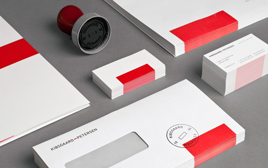
The new visual identity for Kibsgaard-Petersen, an architecture studio based in Aalesund, Norway, plays with the substance of a red rectangle. The Oslo-based design studio Heydays has decided for this project to use the glyph in the company’s name as a graphic element to communicate the strong and bold architectural language and visualize, dyeing it …
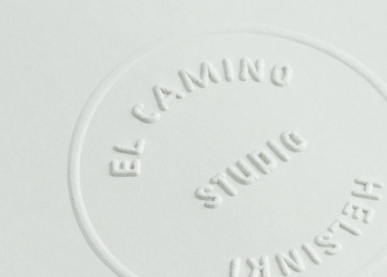
El Camino Helsinki is the audio design studio of Marko Nyberg, an artist and a producer. Its great identity project was designed by Tsto (a one year old creative agency based in Helsinki) which based El Camino’s identity around an embossing stamp and a custom typeface.The forms of the typeface were shaped from ten geometric …
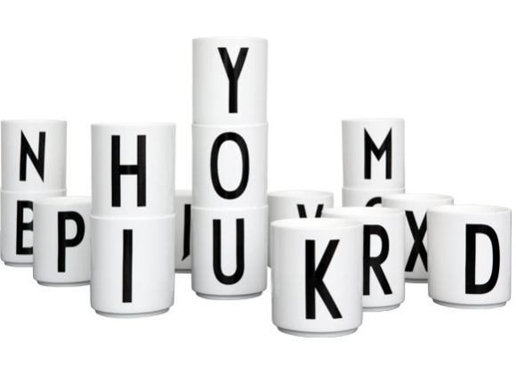
In 1937 the world renowned Danish architect Arne Jacobsen drew a typography for Aarhus City Hall. A Bauhaus inspired typography that despite of its 75 years still looks incredible hot. Recently DESIGN LETTERS was given the permission to revive Jacobsen’s stylish stroke on a beautiful porcelain cup. Now you can enjoy Arne Jacobsen’s elegant typography …
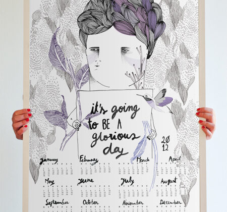
Time goes by really quickly, no? It’s almost a cliche to say this, but in fact it seems that time passes faster and faster with each new year. Why is this? Do you feel it too? Do we have less time, or do we poorly manage our time …? Or are we always running, busy …
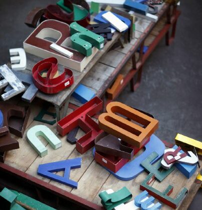
Kidimo gives life back to old signs and letters, creating a vintage atmosphere around you. It consists of a range of words made of zinc, Bakelite or wood letters. Initially part of shop signs, these letters are turned away from their basic purpose and gathered to rewrite a new story in your own interior. Each …
Salottobuono nasce nel 2005 come collettore di diverse esperienze di ricerca e produzione progettuale. Indaga lo spazio urbano alla ricerca di dispositivi in grado di innescare strategie di trasformazione: temi e programmi diventano l’occasione per analisi diagrammatiche o per l’elaborazione di visioni paradossali.
L’attività di Salottobuono si articola in concorsi, workshop, progetti editoriali e incarichi di progettazione.
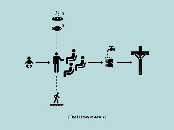
Minimal humour and awful truth in a design package? This witty set of typodesign spreads a new light on many historical facts. By always fantastic Agency H-57 (Milan based).
A must-see video: Letterpress from Naomie Ross about press printing. So elegant and interesting.
Argomenti molto cari a Polkadot sono il riuso e il riciclo di materiali. Organizzata da Zabar in provincia di Bari, Uso Mano è stata, è e molto probabilmente sarà, una mostra itinerante di autoproduzioni, realizzate interamente in carta, sulla carta e con la carta, considerata quindi non “solo” supporto ma anche elemento modificabile nello spazio. Tutto …


